'%3e%3cpath%20fill-rule='evenodd'%20clip-rule='evenodd'%20d='M0%2062.3176C0%2027.9001%2027.8995%200.00181961%2062.3134%200.00181961L62.3999%2062.2311C62.3999%2096.6462%2034.5004%20124.544%200.0852901%20124.544'%20fill='%233A3D3C'/%3e%3c/g%3e%3cpath%20d='M62.3994%2062.2461V0C96.8133%200%20124.713%2027.8982%20124.713%2062.3158'%20fill='url(%23paint0_linear_6331_3458)'/%3e%3cpath%20fill-rule='evenodd'%20clip-rule='evenodd'%20d='M45.617%2026.2827C47.7276%2026.2827%2049.4382%2027.9933%2049.4382%2030.1052C49.4382%2032.2146%2047.7276%2033.9252%2045.617%2033.9252C43.5064%2033.9252%2041.7958%2032.2146%2041.7958%2030.1052C41.7958%2027.9933%2043.5064%2026.2827%2045.617%2026.2827Z'%20fill='%23F9F6EF'/%3e%3cpath%20fill-rule='evenodd'%20clip-rule='evenodd'%20d='M45.6168%2045.2338C37.2596%2045.2338%2030.4857%2038.461%2030.4857%2030.1038C30.4857%2021.7454%2037.2596%2014.9702%2045.6168%2014.9702C53.9753%2014.9702%2060.7492%2021.7454%2060.7492%2030.1038C60.7492%2038.461%2053.9753%2045.2338%2045.6168%2045.2338ZM45.6168%2012.6686C35.9875%2012.6686%2028.1816%2020.4744%2028.1816%2030.1038C28.1816%2039.7308%2035.9875%2047.5378%2045.6168%2047.5378C55.245%2047.5378%2063.0508%2039.7308%2063.0508%2030.1038C63.0508%2020.4744%2055.245%2012.6686%2045.6168%2012.6686Z'%20fill='%23FECE01'/%3e%3cdefs%3e%3clinearGradient%20id='paint0_linear_6331_3458'%20x1='62.2719'%20y1='4.01754'%20x2='108.703'%20y2='70.5262'%20gradientUnits='userSpaceOnUse'%3e%3cstop%20stop-color='%239ED5CB'/%3e%3cstop%20offset='1'%20stop-color='%23FCE18E'/%3e%3c/linearGradient%3e%3c/defs%3e%3c/svg%3e)
Heatmap chart
Configure a heatmap in Toucan AI to compare two dimensions with cell intensity.
Target Audience: Non-technical users and builders configuring charts in the Library.
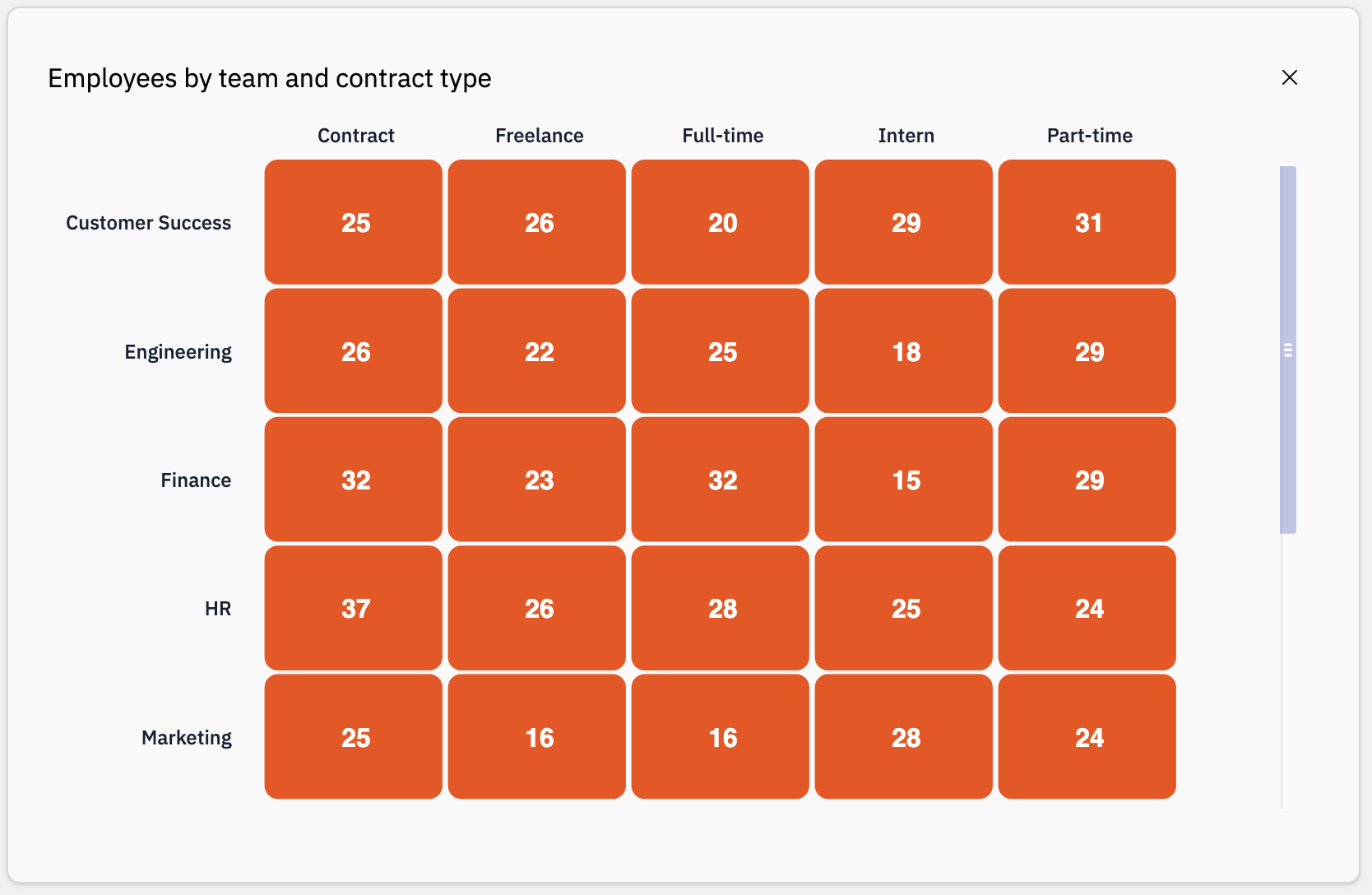
Overview
A heatmap shows a primary cell value for each pair of categories: one on Columns (X-Axis) and one on Rows (Y-Axis). Color intensity reflects the metric. You can add a secondary cell value per cell.
- Dimension: Columns (X-Axis).
- Measure: Rows (Y-Axis), Primary cell value, and optional Secondary cell value.
In the Library, enable Manual Edit, set Type to Heatmap, and map columns under Data.
Shared fields (Title, Narrative, Data) are in Chart types.
When to use it
Good fit
- Compare a metric across two categorical dimensions (region × product, day × hour).
- Spot patterns or hotspots in a grid.
- Show a main metric plus a second number per cell.
Prefer another chart
- One dimension + trend → Line chart.
- Category comparison without a grid → Bar chart.
- Detailed row-level data → Table.
Examples: activity by weekday and hour, sales by region and category, errors by service and severity.
Common setups
- Two categories: Columns (X-Axis) + Rows (Y-Axis) + Primary cell value (e.g. Sum).
- Two metrics per cell: enable Add secondary cell value and set Secondary cell value.
Configuration options
Open the chart in the Library, turn on Manual Edit, select Data, then set Type to Heatmap. Panel Dimension holds the X axis; panel Measure holds rows, primary value, and More measure options.
Prerequisites: connected database, Manual Edit (how-to).
Dimension
| Option | How it works |
|---|---|
| Columns (X-Axis) | Horizontal categories. |
| Date granularity | Only shown when Columns (X-Axis) is a date column. Year, Quarter, Month, Week, or Day. |
| Date format | Only shown when Columns (X-Axis) is a date column. How dates appear on the X axis. |
Measure
| Option | How it works |
|---|---|
| Rows (Y-Axis) | Vertical categories (shown in the Measure panel). |
| Date granularity | Only shown when Rows (Y-Axis) is a date column. Year, Quarter, Month, Week, or Day. |
| Date format | Only shown when Rows (Y-Axis) is a date column. How dates appear on the Y axis. |
| Primary cell value | Metric driving cell color. Often numeric; use Aggregation as needed. |
| Aggregation | On Primary cell value after the column is selected. |
| Format number | Shown when the primary value is numeric (after aggregation). |
| Secondary cell value | More measure options. Shown when the secondary metric toggle is enabled. Same aggregation/format options as the primary. |
The AI assistant can pre-fill axes and metrics; use Manual Edit to adjust.