'%3e%3cpath%20fill-rule='evenodd'%20clip-rule='evenodd'%20d='M0%2062.3176C0%2027.9001%2027.8995%200.00181961%2062.3134%200.00181961L62.3999%2062.2311C62.3999%2096.6462%2034.5004%20124.544%200.0852901%20124.544'%20fill='%233A3D3C'/%3e%3c/g%3e%3cpath%20d='M62.3994%2062.2461V0C96.8133%200%20124.713%2027.8982%20124.713%2062.3158'%20fill='url(%23paint0_linear_6331_3458)'/%3e%3cpath%20fill-rule='evenodd'%20clip-rule='evenodd'%20d='M45.617%2026.2827C47.7276%2026.2827%2049.4382%2027.9933%2049.4382%2030.1052C49.4382%2032.2146%2047.7276%2033.9252%2045.617%2033.9252C43.5064%2033.9252%2041.7958%2032.2146%2041.7958%2030.1052C41.7958%2027.9933%2043.5064%2026.2827%2045.617%2026.2827Z'%20fill='%23F9F6EF'/%3e%3cpath%20fill-rule='evenodd'%20clip-rule='evenodd'%20d='M45.6168%2045.2338C37.2596%2045.2338%2030.4857%2038.461%2030.4857%2030.1038C30.4857%2021.7454%2037.2596%2014.9702%2045.6168%2014.9702C53.9753%2014.9702%2060.7492%2021.7454%2060.7492%2030.1038C60.7492%2038.461%2053.9753%2045.2338%2045.6168%2045.2338ZM45.6168%2012.6686C35.9875%2012.6686%2028.1816%2020.4744%2028.1816%2030.1038C28.1816%2039.7308%2035.9875%2047.5378%2045.6168%2047.5378C55.245%2047.5378%2063.0508%2039.7308%2063.0508%2030.1038C63.0508%2020.4744%2055.245%2012.6686%2045.6168%2012.6686Z'%20fill='%23FECE01'/%3e%3cdefs%3e%3clinearGradient%20id='paint0_linear_6331_3458'%20x1='62.2719'%20y1='4.01754'%20x2='108.703'%20y2='70.5262'%20gradientUnits='userSpaceOnUse'%3e%3cstop%20stop-color='%239ED5CB'/%3e%3cstop%20offset='1'%20stop-color='%23FCE18E'/%3e%3c/linearGradient%3e%3c/defs%3e%3c/svg%3e)
Bar chart
Configure a bar chart in Toucan AI to compare categories or rankings.
Target Audience: Non-technical users and builders configuring charts in the Library.
Overview
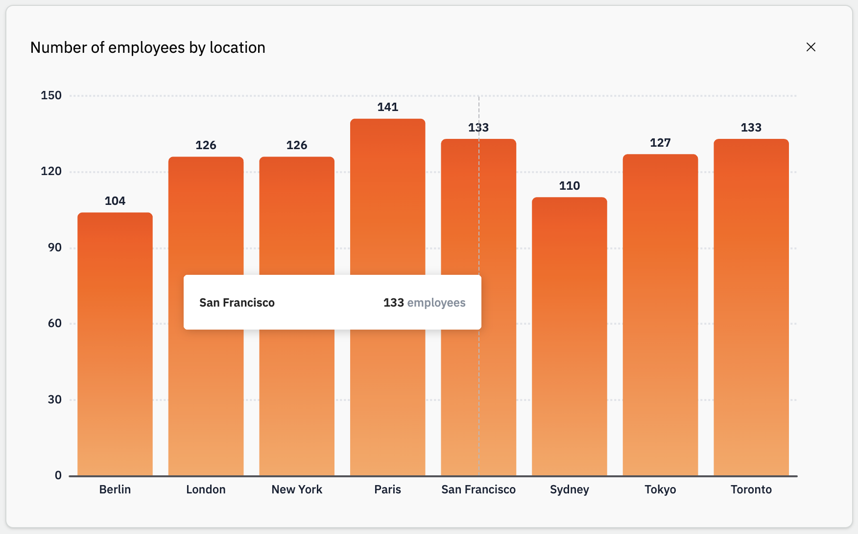
A bar chart compares a measure across categories. Each bar’s length reflects Bar height; categories come from Bar category (vertical: horizontal axis; horizontal: category axis for rankings).
- Dimension: Bar category plus optional Orientation (vertical or horizontal).
- Measure: Bar height — one query column, with optional Aggregation.
- Optional: Group bars for side-by-side bars, or a Line overlay (vertical orientation only).
In the Library, enable Manual Edit, set Type to Bars, and map columns under Data.
Shared fields (Title, Narrative, Data) are in Chart types.
When to use it
Good fit
- Compare values across categories (sales by region, headcount by team).
- Show rankings with horizontal bars and optional Show rank.
- Combine bars with a second metric as a line (vertical only).
Prefer another chart
- Trend over time → Line chart.
- Part-to-whole within each category → Stacked bar chart.
- Share of a total (few slices) → Circular chart.
- One big number → Value.
Examples: top products by revenue, department headcount, monthly sales with a target line.
Common setups
- Vertical bars: default orientation, Bar category + Bar height.
- Ranking: Horizontal + Show rank under More dimension options.
- Grouped bars: Group bars under More dimension options.
- Bar + line: vertical orientation, Line Y-Axis in the Line section.
Configuration options
Open the chart in the Library, turn on Manual Edit, select Data, then set Type to Bars. Panels: Dimension, Measure, and Line (vertical only). Advanced fields: More dimension options / More measure options.
Prerequisites: connected database, Manual Edit (how-to).
Dimension
| Option | How it works |
|---|---|
| Orientation | Vertical (default) or Horizontal. Horizontal hides the Line section. |
| Bar category | Category axis (X when vertical, Y when horizontal). |
| Date granularity | When Bar category is a date: Year, Quarter, Month, Week, or Day. |
| Date format | How date labels appear on the category axis. |
| Order bars | More dimension options. Sort by a column, ascending or descending. |
| Group bars | More dimension options. Side-by-side bars per category value. |
| Show all labels | Only shown when Orientation is Vertical. More dimension options. Label under each bar. |
| Show rank | Only shown when Orientation is Horizontal. More dimension options. Rank numbers on the category axis. |
Measure
| Option | How it works |
|---|---|
| Bar height | Column for bar length. Often numeric; use Aggregation (e.g. Count rows) otherwise. |
| Aggregation | Reduces rows before plotting (see below). |
| Format number | Shown when the measure is numeric (after aggregation). Standard, Percent, Currency, decimals, Unit. |
| Show value on bar | More measure options. Values on bars (on by default). |
| Automatic y-axis scaling | More measure options. On by default; off for Min / Max. |
| Exclude 0 values | More measure options. Removes rows where the measure is 0, null, or empty. |
Line (vertical orientation only)
| Option | How it works |
|---|---|
| Line Y-Axis | Second metric as a line. Clear the column to remove the line. |
| Aggregation | Shown after Line Y-Axis is selected. |
| Show value on line | Values on line points. |
| Unify scales for bars and lines | On by default: bars and line share one scale. |
Aggregations on Bar height and Line Y-Axis
| Aggregation | Typical column types |
|---|---|
| Sum, Cumulated sum, Average | Integer, float |
| Minimum, Maximum | Integer, float, date |
| Count rows, Count distinct | All types |
| Standard deviation | Integer, float |
The AI assistant can pre-fill these fields; use Manual Edit to adjust.
Suggested next steps: Chart types · Line chart · Customize a chart manually · Create a chart with AI